The first tram in the new PID color scheme ran in Prague
After maintenance, the tram has a repainted front, the sides of the cabinet have stickers.
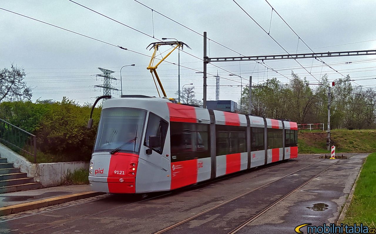
Vehicle 14T number 9121 became the first tram to receive a new color scheme for Prague Integrated Transport. Most trams, buses or, in the future, trolleybuses should gradually travel around Prague in the same colors.
He was the first to draw attention to the test drive on his Facebook server profile MobilniTabla.cz. Pictures of the tram in the new paint have already leaked during the tram’s stay in the workshops, where regular maintenance took place. According to the server, both front trams and some details are directly painted, but the side surfaces are made of adhesive foils.
In the new color design, the SOR NB12 bus has been running on line 176 between Charles Square and Strahov since September 2020. The authors of the design are Mikuláš Macháček, Petr Štěpán and Bohumil Vašák from the superlative.works studio. Last week, he won third place in the Czech Grand Design competition in the Graphic Designer of the Year category.
Prague does not expect to repaint all vehicles, it will only be newly acquired vehicles or repairs or replacement of stickers. According to Prague councilors, the designers designed a very modern, clean graphic solution for the entire system, which also refers to the iconic T3 tram in terms of color. “An important criterion was the clarity of the system, comfortable readability of the font and security. Without further increased costs, the newly acquired Prague public transport vehicles will be in a modern and uniform color design, which was for the first time in the history of the design competition., “Said Prague in a press release last year after the declaration of victory superlative.works. From the new graphic manual, it promises to unify city and suburban buses.
The winning design uses a symbolic red color for Prague. It is complemented by a shade of light gray, which unifies the existing different painting of vehicles. Currently, at least 12 different shades of color are used (except for trains, where there are even more colors). The new solution then counts only 3 colors (including trains). The manual also includes unifying elements for the PID system and the Ropid transport organizer. This should be reflected in the form of uniform logotypes of institutions and in all communication.
Unification for 15 years
The most striking feature on the vehicles are the red vertical stripes, which are based on a new visual style. They support safety in operation, easy visibility at a distance and orientation when boarding, they usually mark individual doors. “In addition, the chosen shade of gray will support the impression of generally clean vehicles; the pollution caused by normal operation was more noticeable on the white paints used so far. The stronger use of the new PID logo will raise awareness of the uniformity of the system across all modes of transport, ”Added Petr Tomčík at the presentation of the Ropid design last year.
The basis of the new logo is the letter “i” with a distinctive dot, which symbolizes the traffic route and stop, a section of the orientation plan, but also the figure of a person / passenger. It also represents the word “integrated” in PID or ROPID tags. The PID Grotesk font, tailor-made by the leading Czech typographer Tomáš Brousil, meets the requirements for trouble-free readability in print and on displays.
“The unification of graphics will take place gradually over a period of 15 years. Czech Railways is now preparing a similar visual maintenance for cars on all CityElefant trains, which run on the border of Prague and the Central Bohemian Region. I am glad that the winning design of visual identity is modern, original and memorable, with a strong and functional concept. The new visual identity will ensure a uniform vehicle labeling scheme, as is the case in the leading European capitals,“Said the mayor of Prague Zdeněk Hřib last year.
145 comments