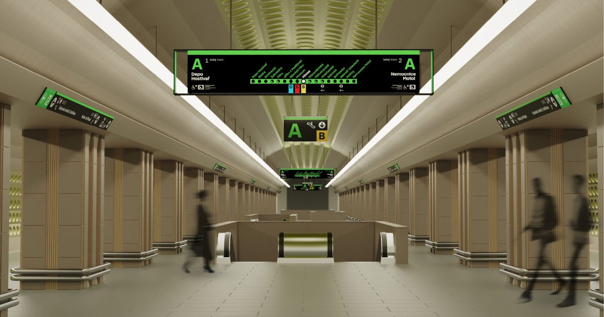
These are not signs, but a service to the public. Prague will have a new orientation system
Why are new blackboards written in white on black? Will they be big enough and not too crowded? Prague also has a new font, Prague Citizen. Why and what is it like? And when will it all be? After the introduction of the new orientation system, a lot of questions arose. So we laid them down directly to its creators.
Richard Jaroš above all that it is “not just about signs”. It is also about being in the right place and providing the right information. You also want to clear the traffic area of visual smog so that things are truly visible. On all this, the studio will cooperate with eight (!) Organizations that take care of public transport in Prague. Therefore, the current orientation system was quite confusing.

“It used to be that someone called someone to make a sign, and they made it,” says Tomáš Machek. So it could happen that the new information denied the previous ones. Now the system should work according to uniform principles. How, this can be seen in the instagram account Readable Prague (@legible_prague).
As the name suggests, the goal is to make the capital clear and legible – in English readable. We also talked about this concept with Mike Rawlinson from London, who is the creator of many orientation systems and chaired the jury of the Prague competition. “Don’t just take it as a sign. It is a service to the public, “he says.
We also talked about why change is needed. What’s the point of orientation boards when everyone walks by mobile phone? And which city systems were the graphic designers inspired by? You’ll find out in the Demolition.