Competition for a new inclusioplus psychiatric building in Baselland: all ranked projects
Metron Architektur AG from Brugg won the competition for the new inclusioplus building for the Psychiatry Baselland in Liestal. We already presented the initial situation and the winning project some time ago. Today we take a look at the three ranked projects.
Scope of the project competition. Illustration: Architektur Basel, bases: © Federal Office of Topography swisstopo

2nd prize for the project contribution named «Am Bach»

The Dietrichsbrunnenbächli flies in the space between the two buildings.
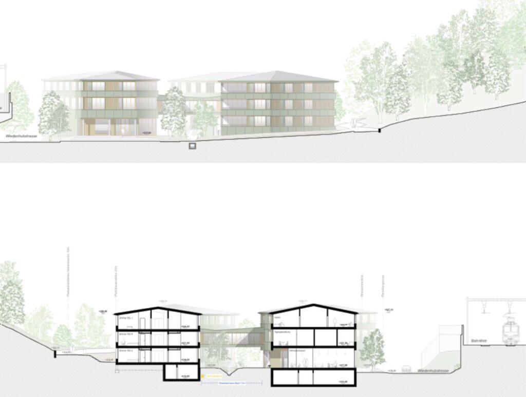
In contrast to the winning project, the team from Schmid Schärer Architekten decided to divide the required rooms into two different buildings. In doing so, they placed the smaller volume with the work rooms and day-to-day activities in the north-east. The much larger residential building is oriented towards the forest. The semi-public, extra-high ground floor skilfully overcomes the rising topography, while the residential building meets the hill with a raised ground floor. The two buildings share the storey, but they are connected with a bridge. The culverted Dietrichsbrunnenbächli flows between the two houses. This creates two different outdoor areas between and behind the houses. While the small house is clearly accessible via Wiedenhubstraße, the entrances to the residential building are in the south-west between the residential building and the forest.

The residential building faces the slope.

At the same time, the outer form also results in the inner rooms.
The extra high ground floor makes the difference.
The individual apartments are arranged along the facades. The spatial development of the inner corridor therefore follows the form of the outer building in what is shown, but does not appear boring, although in places it appears somewhat unfavorable in terms of daylight. The broken ends become places to eat and sit and close off the individual residential groups. The jury likes the overall concept and says: “The clear separation of work and living spaces leads to a maximum of “normality” in the daily routine.” The committee sees the lighting situation in the lowermost rooms on the hillside in the residential building as less convincing. Daylight only comes down via a half-storey excavation: “The teasing outside stairs to the studios on the 1st floor shade the already not bright rooms on the ground floor.”

3rd prize for the «TRIFOGLIO» project

A solid base with a lightweight construction on top? Not quite…
The design by Malte Kloes Architekten is downright urban. The building has three floors on the ground floor and a recessed attic. The floor plan is organized in three wings arranged at right angles to each other; one each to the narrow sides of the competition perimeter and one to the railway line. The entrances are located in each of the joints. You have to look for the main entrance first. That’s less bad. The placement of the access core is more disruptive. It’s a bit off the main entrance. The lift and stairs are also unfavorable on the upper floors. Although their position enables space-efficient access on the floor, they are also in the light of the corridor. literally. The jury is not exactly enthusiastic about the somewhat cramped situation: “(…) on the other hand, there is the unnaturally lit and unattractively designed development core without any external reference”, and adds: “The placement or the position of the three wings in relation to one another prevents clear orientation in the building development core.» We agree. In return, the individual living groups enjoy generosity and, thanks to the three wings of the building, a multi-sided orientation. The jury report also has eyes for this and praises it: “If necessary, the upper floors can be spatially separated according to their function. The centrally arranged common areas with the attractive loggias create a good overview.»

The building consists of three parts.

The vertical development cannot be found immediately from the entrance…

The development core forms the linchpin of all three parts of the building.
Structurally, it is a solid building with an attached wooden facade on the upper floors. Only the attic is an actual timber construction. The much-vaunted “constructive honesty” is also visiting elsewhere today. So it might be. The jury doesn’t seem grossly bothered by it. She seems to like the appearance as such anyway. As for orientation and shape, we agree. However, we dare to doubt whether the volumes are suitable for the location. The building actually calls for a flat topography. But there are only a limited number of them here.

4th place for the «Tanzboden»

“Can I buy these grapes here?”
Now it’s getting exciting! With all due respect, we have more or less seen the home typologies of the projects in the first three places somewhere, the “Tanzboden” comes up with fresh ideas. The five-strong team from the Dieter Gysin and Eggenschwiler Perroud consortium put down a proposal that you only understand on closer inspection. All uses are accommodated in a single volume. The building moves as close as possible to Wiedenhubstrasse and the railway embankment, but is isolated in the other cardinal directions and leaves a lot of space for the outside space with the above-ground Dietrichsbrunnenbächli on the rising slope. The two-storey base building with a small footprint is followed by two cantilevered upper floors. Access is via the corner of Wiedenhubstraße/Goldbrunnenstraße, delivery via the entrance to the company fire brigade. The access floor offers a spacious access in the form of an inner gallery, including the café in the multi-purpose room and various studios. Oversized rooms stick upwards. All the apartments are located above it – and thus just on the horizon of the railway embankment. Unlike the elongated galleries on the lower floors, the upper floors are accessed via a layer of arcades and internal “streets” running across the building. All of the apartments are on the facade and, with the exception of one residential group, have balconies. An inner lounge area completes the offer. The entire spatial program is inscribed in what appears to be a sophisticated grid of supports. However, the positioning of individual supports seems somewhat arbitrary – and then it is also noticeable that certain supports on the residential floors seem to go their own way – without any relation to those on the floor below. You can ask yourself: Does this concept still make sense? However, reading the project will not be boring. But on the contrary; you’re always discovering something new.

As close as possible to the railway embankment, as much free space to the south as possible.

On the two-storey pedestal stand…

… overhanging residential floors. A carpet of uses…
Things spread out over the floors like a carpet. Pitched roofs close off the building at the top. The designers promise a minimal footprint, as well as summer sun protection through the arcades, standardized facades and many climatic buffer zones. We mean: fulfilled! At least partially… Not everything should work as intended. The balconies directly in front of the residential units, which are accessible to everyone, limit the privacy of some of the rooms. If there is no personal retreat without a curtain, the sunny side of the facade is of no use either. The jury agrees and notes: “The southwest-facing terraces of the middle residential group are valuable as a place for community, but problematic for the adjacent residents’ rooms in terms of intimacy and lighting.” With a few specific points of criticism, however, the jury praised the overall system as a fresh idea and the presumed atmosphere, which is not at all reminiscent of a home! Despite it. Overall, the question of what is concrete arises. Despite the detailed section, the project proposal does not provide any precise answers to architectural questions. There is a real danger that the convincing basic idea could lose its magic in the wake of the detailed elaboration. Ultimately, the idea remains at a very conceptual level. But as such it is very readable!
Finally, we would like to know where the promised dance floor is hidden and where it will find it in the annex building against the company fire brigade. A separate outside staircase leads up to a greenhouse. The architects call it the Orangery. Yes why not…
In addition to the four ranked projects, six other competition entries were received.
Text: Simon Heiniger / Architektur Basel
Sources:
– Report of the jury of January 12, 2021 / PBL media release of January 20, 2022