Prague 6: The new logo aroused passions! “Pocket” and “pint without an ear”
People tend to be picky about changes of any kind. She does not like having to learn to perceive anew what she has been used to for years. The second thing is the execution itself. When Prague 3 presented its new logo, people made fun of the “three dashes” next to the name Prague. They compared the simple logo to the effect of falling dominoesto the failed Three Sisters logo or perhaps to bill for beers in the pub. Others praised the style. Reactions to the new Prague 6 logo, which emerged from a competition already recognized by the Czechdesign organization, are similarly contradictory.
»A pint without an ear?«
“Prague 6 was the first district to introduce its own logo and visual style 17 years ago. Over time it turned out that the logo, which appeared to be very modern at the time, does not quite suit all needs, which part of the city has,” said acting mayor of Prague 6 Ondřej Kolář (TOP 09). That’s what he was until now a simple square with the inscription “Městská část Praha” and the number 6 in a circle. All this only in blue and white.
The current logo of Prague 6
Author: City Council Prague 6
It’s new about white inscription Praha 6 in a green field, which is crossed from top to bottom on the side. Although, according to Petr Krejzka from Studio ReDesign, the logo is supposed to resemble functionalist architecture and at the same time follow on from the so-called a shield with rounded lower corners, in which there are city symbols, people on social networks began to understand the new logo in their own way shortly after its publication. “Pocket for change?” voiced on the Facebook group Dejvická parta Marie Č. “It also evokes a pocket for me. On the shirt,” added Kateřina G. “Like a sign in an elevator,” smiled Jakub J.
“A pint without an earuser Tomáš M let himself be heard. While some chose what the new logo was based on, others already expressed their satisfaction: “I didn’t choose it, but I really like it,” admitted Ondra V. But there was also indignation and displeasure. “Fairly bizarre and a few steps back“I think Luke S.”If someone from a graphics studio came up with this, I’d make them unemployed,” added Jarda D. And Tereza T. came in third: “If it has the dimensions of a projective psychodiagnostic test, then I see a roof tile. And a really repulsive color. the resulting impression is confused,” she said. People also compared the logo to a parking sign, and they also criticized the choice of color.
The new logo of Prague 6. Will the residents accept it as their own?
Author: ÚMČ Prague 6
Everywhere only blue, red, yellow
However, according to Kolář, it should literally “poke” every resident of Prague 6. “We wanted to emphasize the fact that Prague 6 is one of the greenest parts of the capital city. That’s why we switched from blue to green,” Kolář explained to Blesk. On the territory of Prague 6, for example, Wild Sárka, Hvězda nature reserve, Šárecko valley, “green” residential areas like Hanspaulka, Ořechovka, Střešovice or baby even a small part Trees. In addition, Prague 6 is also home to Green Street and the public transport stop of the same name.
But it wasn’t just in this case. According to Kolář, among the participants in the open competition for a new logo and visual style, of which there were 76 in total, the town hall emphasized that the logo original even in color. “When we surveyed all parts of Prague, most lean towards a blue, red and yellow color scheme. We therefore wanted to make Prague 6, its genius loci, visible in some way. And Prague 6 relies heavily on green environmentalism,” explained Krejzek, who came up with the new visual together with graphic designer Kateřina Šuterová.
It is far from just a new logo. Similar to Prague 3, Dejvická town hall also chose to change new uniform visual stylel, which will be based on green color and Czech script Grotesque Civil. “It was created by Vojtěch Říha from UMPRUM, so we also have a Czech font that works well and harmonizes the niveau spirit of modernism,” Krejzek explained. The new design will be reflected, for example, in the form of the town hall website, on posters, promotional items, names of municipal buildings, etc. The winning design was approved by a jury consisting of experts and representatives of the Prague 6 office unanimously.
»Pocket« for three quarters of a million
According to the mayor, Prague 6 was looking for a new design roughly a year. How much did that “half liter without ear” or “pocket” cost in total? They weren’t small. “The first four places in the competition were valued at 80,000 crowns, with the winner, the ReDesign studio, receiving from the town hall contract for processing a new visual identity and its implementation for 700 thousand crowns“, Kolář explained to Blesk. So the winner got 780,000, and the total amount is a start exceeding one million crowns for the competition.
When they introduced the new logo, Kolář was sure that they would provoke different reactions. i’m mocking “I have already heard opinions that there is no need to make a new logo. But over time, a new logo and visual identity will emerge will be functional. They say that there is beauty in simplicity and the new logo is very simple and above all in which one recognizes that it refers to Prague 6, which I consider important” he explained to Blesku. After all, according to Krejzka, the logo is in the spirit of the motto: I live here and I’m proud of it. “Every change brings contradictory reactions. Now I guess it will be 50 to 50,” I think Kolář.
Town hall beer
The Dejvice town hall also has its new “Beer of Prague 6″ from the Bubeneč brewery, which celebrates not only the new visual, but also 100 years since the connection of Bubeneč to Prague 6. It will be the so-called “Light Six” that is, a weak six-level beer special brewed by local brewer Michal Jusko.
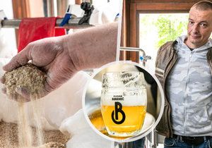
“It is a fermented classic beer that has between 2.5 and 3% alcohol,” the brewer said. “We used the Pink Boots HOP Blend, a combination of 3 American hops, which makes it a fragrant beer, even if weak, so strong in taste.” Will be available exclusively at the Bubeneč brewery, which is located near the Dejvick town hall. “So far 500 liters have been brewed, and when it’s drunk I’ll see if the brewery will finish it or not based on public interest. We would like it not to be a one-off batch,” concludes Tereza Schejbalová, head of the communications department, for the Prague 6 City Hall.
Prague 6 presented a new logo in October 2022. Will its inhabitants accept him as their own? ÚMČ Prague 6
With the new logo of the district, Prague 6 also presented a new visual style.
Author: David Zima