Deteriorating epidemic situation: almost the whole of Hungary has turned dark red on the map
ECDC’s map, updated today, essentially faithfully reflects the spectacularly deteriorating domestic epidemic data of recent weeks. We have written about the exponentially larger epidemic curve and its consequences in several of our articles recently:
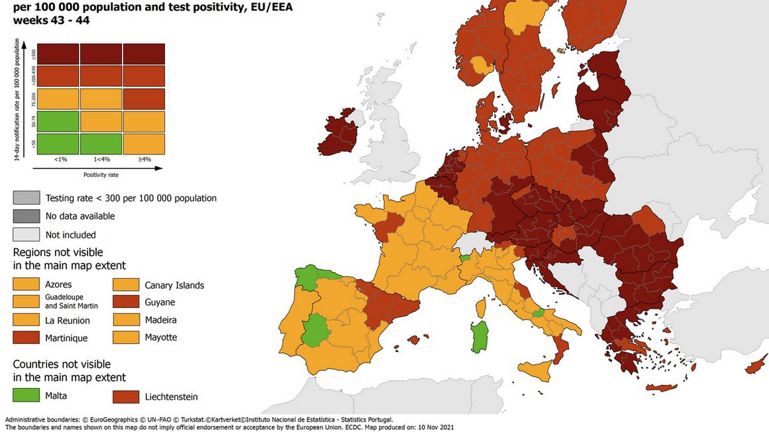
The map classifies the individual countries and regions into categories based on the registered new infections and the positivity rate of the tests (ie the detection efficiency). Green indicates milder dynamics and red indicates more severe dynamics. In the dark red category, a region is included if the 14-day cumulative infection rate is 500 or above.
For a week and a half, only the southern and northern parts of the country were in the dark red (worst classified) category, today, with the exception of Northwest Hungary, the whole country is in the dark red category.
Why is the map important?
Color coding is also important in the European Union, and the map supports the Council Recommendation on travel within the EU with information. So it is not only the presentation of the current epidemiological picture on the map that is important, but also the previous ones agreement important for the development of entry rules.
According to the recommendation it sets out, they should actually push for non-essential travel delays to and from areas classified as ‘dark red’. Those classified as “dark red” should be required to have a negative test certificate and be subject to official or voluntary quarantine. they must require those interested in areas classified as ‘orange’ or ‘red’ to have a negative test certificate.