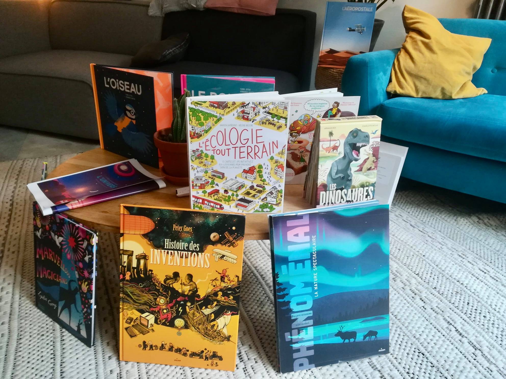
Milan explores a new identity
” Open wide the eyes of our readers, from the little ones who read from the tips of the little ones to the one who tells it out loud, when we all surprise them by innovating. Open wide the eyes of our audiences when we accompany them, gently, in their discovery of themselves, others and the world, helping them to see beyond the horizon », This is the credo of the house.
And in a press release to continue:
“This logo is the sign of our constant renewal, the one that inspires us our desire to always be closer to children. Prevent the natural aging of any creation; always adapt; do not let yourself be overtaken. It is the vitality of this logo that emerges when we put Milan in an image, to make the link with what is at the heart of our creations: youth.
We read the gentleness that we put in all our productions, which want to accompany, with tenderness and benevolence, our readers in their exploration of the world; the gentleness with which we enter into contact with our audiences, so that everyone can find a setting, of course, a reassuring, “round” setting, and allow everyone to enter life with confidence and grow serenely.
We see our desire to introduce emotion into the transmission of knowledge and into the construction of our relationships with others, of our reflection, of our commitment. With the point of the “i” which stands out, rises to rebound better, expresses our grain of fantasy, the one that we put in our productions in order to burst the joy of our audiences. Even when he’s serious, Milan always clowns a bit to laugh with them!
The red indicates our attachment to our brand; we have preserved its color, because it is the color of life. The red contrasts with a white which says, the simplicity with which we want to approach our exchanges with our audiences. Red and white, to finally say that the reality is contrasted. But it is gently that we say it to our audiences for a long time and for a long time.“
Photo credit: MIlan