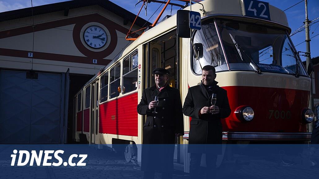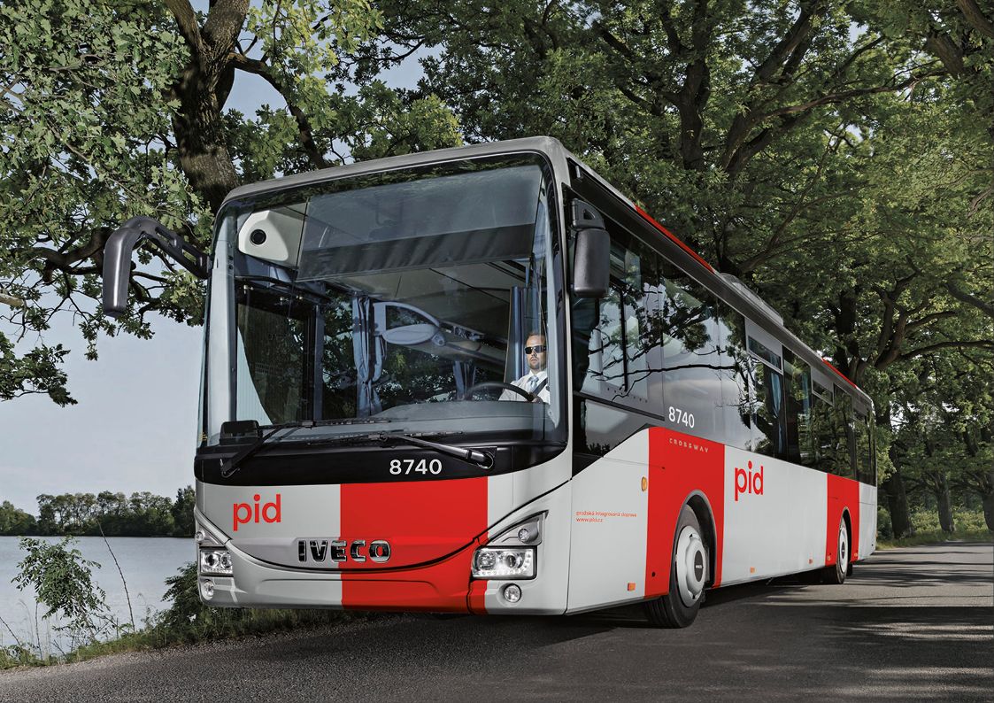
Design revolution. Trams and buses in Prague will change colors after many years. The bars will be vertical
The appearance of trams or buses in Prague has not changed drastically for many years. The red color usually “wraps” the car body longitudinally, the rest is white or cream. The design of the graphic designers from superlative.works – which was approved by the Prague Council on Monday – is going in the opposite direction. The stripes on the sides will no longer be horizontal, but vertical. However, the vehicles will not be repainted en masse, they will only get them when the paint is renewed.
The change concerns the metro or suburban trains. You too will have a unified gray-red design. The designers also chose the light gray color because it is easier to repair locally than metallic shades. However, the legendary T3 trams, or their modernized types, should not be repainted.
“For existing vehicles, the paint will be replaced during major renovations and especially during the purchase of new vehicles, where stickers and paintings would occur as well,” said Deputy Mayor Adam Scheinherr (Prague himself). According to him, the plan does not mean any additional costs.
On the contrary, thanks to the smaller number of colors, this variant will be more economical, as PID devices currently have 17 different types of colors. “The paints are more resistant to normal operational pollution, I believe I bring savings,” he added. According to Scheinherr, the cost of the competition and the creation of a graphic manual was almost two million crowns.
The transport of the new coat will not be completed by the end of the year
This year, however, Praguers will not see the new look of public transport. “We are now working on a prototype bus. Electric buses will also compete, and all new vehicles will be in a new design,” Scheinherr said of the planned changes.
According to its authors, the design is also well recognizable from other manufacturers. “We chose the red shade, which is used on the iconic T3 tram. We have combined the white, gray and silver into one color,” says co-author of the future style Bohumil Pašák.
According to him, the simpler design of red and gray should not be as prone to contamination as white. “The roof will not be as dark blue as it is today. We will save oil because the roof will not overheat and attract light,” Scheinerr added, adding that the designers would still be dealing with the appearance of the ferries.
The new design will also have public transport in the Central Bohemian Region, which is gradually being integrated into Prague Integrated Transport (PID). This was also one of the reasons why the city administration began to negotiate a uniform form of vehicles. This makes it easier for passengers to know where their ticket is being paid.
The graphic studio superlative.works – which succeeded in last year’s competition – is to draw up a complete graphic manual, which is then re-performed by the city and possibly the regional authorities. The transformation of the identity of Prague’s public transport is part of a contract called RebrandingPID. It was approved by Prague councilors last June.
With the help of Czech Design, the city management announced a closed design competition. In two rounds, a jury composed of experts and city representatives decided on the winner of five participants.
Due to its organization, Czech Design approached the Regional Organizer of Prague Integrated Transport. The graphic studios Heyduk, Musil and Strnad, as well as Mr. Steinert, Side2 or ReDesign.
Tradition is broken. The highlighting of the door is also missing, says Kotas
However, the architect and author of the design and the current color scheme of the 15T tram or M1 metro Patrik Kotas protests against the change in the current appearance of the cars. According to him, the management did not communicate with him about the possible modification of the design of the cars he designed.
“I wrote a polite letter to the municipality, in which I drew attention to my copyrights and the belief that a decision would be made when we would not be in any conflict,” Kotas told Aktuálně.cz.
However, no answers were received, so they subsequently turned to the city management through a lawyer. “Unfortunately, the city did not react to him in any way,” no architect explained. If the city proceeded to repaint the author’s vehicles, Kotas would defend itself with a lawsuit.
However, Deputy Transport Minister Adam Scheinherr does not bother that the new design of Kotas’ vehicles will not apply. “I do not know that we would buy the means of transport designed by Mr. Kotas,” he told Aktuálně.cz. He also added that he had met the architect in person a few weeks ago and discussed the impact of future designs on his vehicles.
However, Kotas also rejects the new style of public transport from a professional point of view. “Its appearance does not respond to the shape of vehicles. In addition, it does not include the traditional visual style of Prague transport,” says Kotas. He adds that this was red, white, silver or cream horizontal stripes, not vertical.
White and red are iconic colors for Prague transport
According to Pavel Fojtík, the white-red combination of historians is historically characteristic of Prague trams. “Over the years, however, the white color changed to cream. Witnesses said that this was due to the fact that the white paint began to turn yellow,” an expert specializing mainly in the history of Prague transport told Aktuálně.cz.
The author of the current appearance of trams Patrik Kotas but also on the functional aspect of the design. “The door has always been highlighted as a visual and orientation element for passengers. But this completely denies the new style. Whether it is trams, buses or trains,” Kotas added.
However, visibility will be indicated on metro design proposals. “We mark the boarding areas for passengers so that even the visually impaired do not have a problem orienting themselves where the boarding area is,” designer Mikoláš Macháček told the press.
The design authors also used good visibility for the new PID logo. “Below the letter, you can imagine a piece of the route plan and the stop. Together, we see the figure of the passenger,” said one of the creators of the new design, Bohumil Pašák.
The Governor of the Central Bohemian Region, Jaroslava Pokorná Jermanová, also drew the attention of the municipality to potential conflicts of interest and copyright infringement. According to the Deputy Minister for Transport, Adam Scheinherr, however, the representatives of the Central Bohemian Region understood the results of the competition differently, they also participated in the selection committee, which accepted the proposal without reservations.
The political opposition also has reservations about the new municipal proposal. Representative of the capital city of Prague Jiří Pospíšil (TOP 09) to disagree with the meeting on your twitter account. “There was no public tender, but especially at the time of the coronavirus, public funds need to be used more meaningfully than dealing with the design of public transport vehicles,” he said in his tweet.
The opposition ODS, for example, also criticized the city’s leadership, as it was non-transparent, according to Alexandra Uženiji, chairwoman of the Civic Democrats’ club. The plan is also criticized by the coalition United Forces for Prague (TOP 09 and STAN).
However, the city administration insists that this is a normal procedure. The allegation was also confirmed by the Antimonopoly Office, which did not find a reason to investigate the contract.
The classic duo was replaced by a full-vehicle advertisement in the 1990s
At the end of the 19th century, according to historian Pavel Fojtík, the first electric trams were green, as were the railway cars. The later characteristic cream-red style of trams did not change until 1989, when they began to cover full-vehicle advertisements and coatings.
“The cars started to be green or blue, but it was a temporary matter under the contract,” says Fojtík. He adds that the 1990s also brought new types of trams, such as the Tatra T6A5.
Architect Patrik Kotas worked on its design. The cream disappeared next to it and a black color appeared on the windows and a narrower white stripe below them. The same goes for the chassis. “I quite like this style because it brought something new,” Fojtík added for Aktuálně.cz.
The current form of Prague Integrated Transport dates back to 2008. It includes the Prague tram network, which with a length of 142 km is one of the largest in Europe.
It is necessary to look for savings in the management of the transport company, we are considering a 50 percent increase in fares and a rise in parking prices, we will discuss this. | Video: DVTV